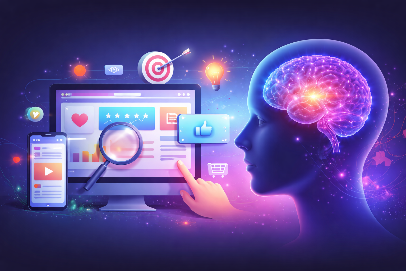
Neuromarketing in UI/UX: How the Brain Decides Before the User Thinks
Explore neuromarketing in UI/UX and how the brain decides instantly. From Colour psychology in UX to social proof, scarcity, and System 1/2 design – discover how to create interfaces users trust, understand, and act on within seconds.
Introduction:
Let’s talk about something most brands completely underestimate: Your users aren’t deciding – their brains are.
And the wild part? Those decisions happen long before the user consciously realizes anything. Before they “like” your design. Before they read your copy. Before they even understand what your product does.
Their brain is already whispering:
Stay.
Leave.
Trust this.
This feels confusing.
Click now.
Not worth it.
That’s where neuromarketing comes in.
It helps us understand the invisible reactions happening inside the brain while someone uses your app or website. And once you understand those reactions, you don’t just design better interfaces.
You design experiences that the brain naturally wants to say yes to.
So let’s break it down.
How does the brain really make decisions? And how can we create UI/UX that works with those instincts instead of against them?
The Brain’s Decision System: (System 1 & System 2)
Here’s the simplest way to think about decision-making: Your brain has two modes, like two apps running at the same time.
System 1 – Fast, emotional, instinctive
This part of the brain reacts instantly. It’s the part that decides within 0.5 seconds whether a website “feels right” or “feels sketchy.”
System 1 is responsible for:
- First impressions
- Gut feelings
- Snap judgments
- Emotional reactions
When a user lands on your website, System 1 makes the call:
“Am I staying?”
“Do I trust this?”
“Is this too much work?”
System 2 – Slow, logical, analytical
System 2 is the thinker.
This is where users compare prices, read content, analyse features, and make rational choices, but only if System 1 gives them the green light.
Here’s the catch:
If your UI doesn’t win System 1, users never reach System 2.
They’re already gone.
This is exactly why Neuromarketing in UI/UX matters: great UI/UX is not built on logic first.
It’s built for instinct.
Emotional Triggers in UI:
People don’t process interfaces rationally – they process them emotionally. And those emotions are triggered faster than you can blink.
Let’s look at the biggest emotional drivers inside UI.
1. Colour Psychology:
Colour is one of the quickest emotional signals the brain processes, often within 150 milliseconds. Before a user reads anything or understands your product, their brain is already forming an impression based on colour.
For example:
- Blue says trust.
- Green says progress.
- Red says urgency.
- Yellow says attention.
Ever wonder why fintech apps love blue and green?
Because those colours instantly tell the brain:
“Relax. This is reliable.”
Choosing colours isn’t about aesthetics alone – it’s about setting the emotional tone of the entire experience. The right palette reassures the user before they even consciously decide how they feel.
2. Microcopy That Reassures:
Microcopy is the small but mighty UX ingredient that quietly guides users and calms their minds. When done well, it removes uncertainty and builds trust without the user even noticing.
Instead of stiff button labels like “Submit”, using warmer, simpler options like “Continue” or “Next step” keeps the user moving effortlessly. During errors or high-friction moments, a single line of empathetic copy can keep frustration from building:
Instead of “Error – try again,”
try “Something went wrong – let’s fix it together.”
This tone reassures the user and makes the experience feel more human. Good microcopy reduces cognitive load, softens friction points, and creates a sense of partnership between the interface and the user.
3. Visual Hierarchy That Guides the Eyes:
If everything is loud, the brain hears nothing.
Users want their eyes to be guided gently – headline → message → action button.
When your layout makes them guess what to do next, System 1 panics.
But when hierarchy is clean and predictable, the brain relaxes.
And a relaxed brain converts.
Persuasive Design Patterns:
Now let’s talk about the psychology-backed patterns that guide users toward taking action – not by tricking them, but by aligning with how human decision-making naturally works.
1 . Authority Cues:
People instinctively respond to authority. It’s wired into how we interpret safety, trust, and credibility. When users see subtle signs that a brand is legitimate – like a certification badge, a security lock icon during checkout, an expert endorsement, or even a recognizable logo partnership – their brain relaxes.
Authority cues work because they eliminate uncertainty. The user may not consciously think, “Ah, this badge proves credibility,” but their brain picks up the signal immediately. These tiny details shift the emotional tone from doubt to trust, quietly whispering:
“You’re in good hands. Others trust this – you can too.”
This is why platforms like Amazon, banks, and SaaS tools lean heavily on trust badges. It’s not decoration – it’s neuroscience.
2. Social Proof:
Humans are social creatures. When we’re unsure, we look to others for guidance – and that behavior extends into digital spaces. Seeing reviews, testimonials, user ratings, client logos, live visitor counts, or“popular choice” tags instantly reassures the brain that the decision is safe.
Even a simple line like “Used by 50,000+ people” reduces hesitation.
A testimonial with a real face? Even better.
A video review? Now you’re amplifying trust on multiple emotional levels.
Social proof taps into our deep-rooted instinct to belong. It signals:
“This isn’t risky. Other people have gone before you – and they’re okay.”
That emotional reassurance is often what nudges a user from thinking about taking action to actually taking it.
3. Scarcity & Nudges:
If there’s one thing the brain hates, it’s missing out. Scarcity triggers a powerful motivational response because the mind perceives limited availability as higher value, even if the user wasn’t fully committed before.
Think about signals like:
“Only 2 left in stock”
“Sale ends tonight.”
“Limited-time offer”
Progress bars show how close you are to completing a task.
These cues activate urgency, but in a healthy, non-manipulative way. They help users make decisions they already intended to make – by giving their brain a little push.
Scarcity works because it taps directly into the brain’s reward and fear-of-loss circuits.
The message it sends is clear:
“Act now, or you might lose something valuable.”
When used ethically, nudges don’t pressure the user – they empower them to move forward with clarity and confidence.
Case Study Example: Before & After Psychology-Based UI Design
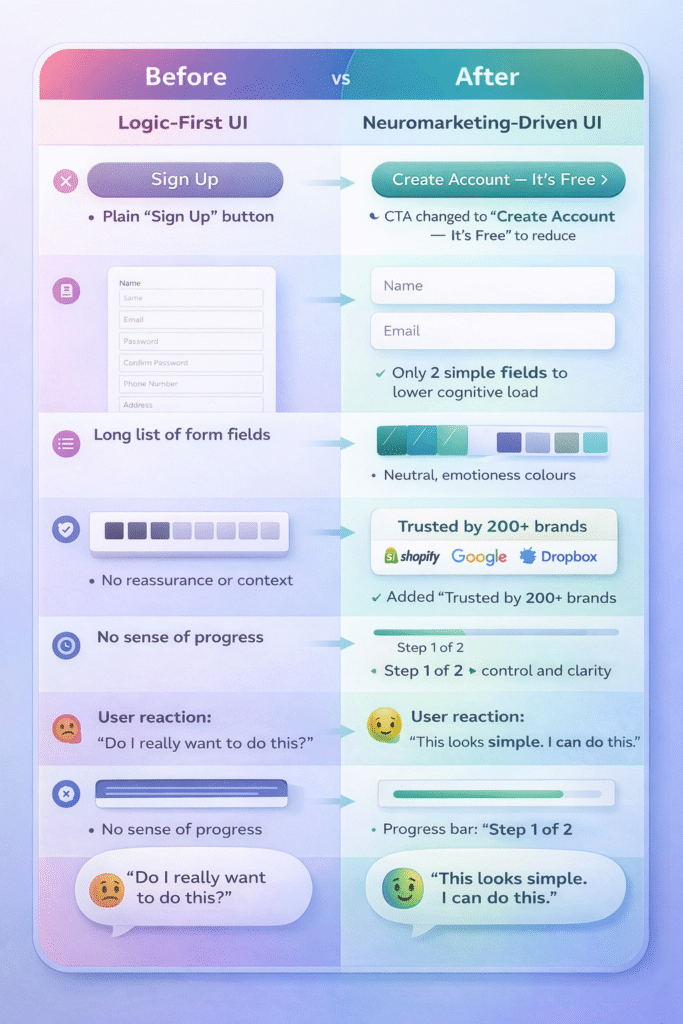
Outcome?
Same flow.
Same intention.
But a totally different emotional experience.
This is neuromarketing in action – small psychological tweaks that change everything.
The 5-Second Brain Formula
If you want a simple, practical way to apply Neuromarketing in UI/UX to any interface, the 5-Second Brain Formula is your shortcut. This framework helps you evaluate whether your UI speaks to the user’s subconscious – the place where decisions actually happen.
1. First Second – Emotion
As soon as the user lands on the screen, the brain checks:
“How does this make me feel?”
Does it feel safe? Clean? Overwhelming? Trustworthy?
Design either wins or loses in this moment.
2. Second Second- Clarity
Next, the brain wants to know:
“What am I supposed to do here?”
If the answer isn’t obvious, anxiety kicks in.
Clarity instantly reduces cognitive load.
3. Third Second – Simplicity
Users now check:
“Is this going to be easy or painful?”
Too much text, too many buttons, too much clutter, and System 1 rejects the experience.
4. Fourth Second – Motivation
The brain then looks for a payoff.
“Why should I continue?”
This could be value messaging, social proof, or simple reassurance.
5. Fifth Second – Action
Finally:
“Can I take the action easily?”
The CTA must be visible, meaningful, and emotionally aligned.
If your UI passes these five moments, you’re designing for the way the human brain naturally processes choices.
And that’s the whole point:
When you design for the brain, the user follows effortlessly.
Conclusion: Design for the Mind, Not Just the Screen
Great UI isn’t about pixels, layouts, or trends.
Great UI is about how a user feels the moment they interact with your product – safe, guided, understood, and motivated. Neuromarketing helps us bridge that gap between design and emotion by tapping into the shortcuts and instincts that drive real human behavior.
At Karm Digital, this is the heart of our approach.
We don’t just create interfaces – we craft experiences built on psychology, intuition, and trust. Whether it’s a landing page, an app flow, or a complete digital ecosystem, our goal is to design for the mind first, the screen second.
Because when you design with the brain in mind, conversions become natural, engagement becomes effortless, and your product becomes memorable.
related blog
-
WordPress vs Webflow: Which Platform is Better for Your Website in 2026?
-
Figma vs Webflow: Website Design vs Development Explained
-
Impact of eBooks in Digital Marketing: Lead Generation & Brand Authority
-
Neuromarketing in UI/UX: How the Brain Decides Before the User Thinks
-
Designing for Trust: Psychological Triggers That Make Users Say ‘Yes’
-
AEO vs SEO: Why Answer Engine Optimization Is Rising in 2026?
-
Emerging UI/UX Trends for 2026: A Complete Breakdown
-
How to Measure Your SEO Success: The Real Metric Most Businesses Ignore
-
Why Good UI/UX Still Fails: The Psychology Traps Designers Overlook

Begin Your Karma

Karmic Presence

INDIA
- elephant@karm.digital
- Vraj Valencia, Behind Mahindra Showroom, Sarkhej Bridge, Sarkhej - Gandhinagar Hwy, Sola, Ahmedabad, Gujarat 380060