Designing for Trust: Psychological Triggers That Make Users Say ‘Yes’
Discover how to design for trust using psychology-backed UI/UX triggers. Learn how predictability, transparency, social proof, microcopy, and neuro-design principles help users feel safe and say “yes” faster – a complete trust-building guide for digital brands.
Introduction:
In today’s digital world, users don’t give brands second chances. They judge interfaces the same way they judge people – within seconds, intuitively, emotionally, and often without knowing why.
And the one question their brain asks before anything else is simple:
“Can I trust this?”
Trust is the true conversion engine.
You can have stunning visuals, smooth animations, and trending UI patterns, but if the experience doesn’t feel trustworthy, users hesitate, delay, or disappear quietly.
Psychology is at the heart of trust-building.
And smart UI/UX design uses this knowledge to reduce fear, increase confidence, and guide users toward a comfortable “yes”.
In this blog, we dive into the psychological triggers that build trust and how thoughtful design transforms sceptical users into confident customers.
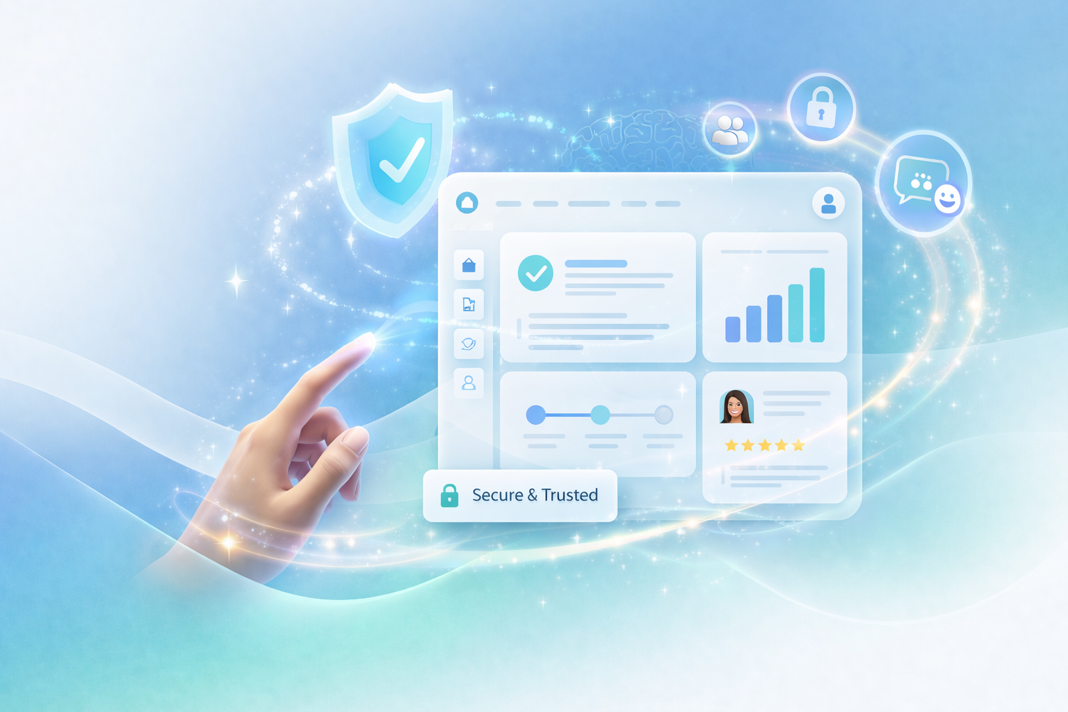
Trust Signals in UI/UX – What Makes the Brain Feel Safe
Trust isn’t built through a single element – it’s a sum of small, consistent cues. Here are the four trust pillars that every high-performing interface relies on:
1. Predictability – The Brain Loves What It Can Predict
Humans trust patterns. When your design behaves the way the user expects, the brain relaxes.
Predictable UX includes:
- Familiar navigation labels (Home, Pricing, Login)
- Consistent button placements
- Standard iconography
- Flows that mirror known mental models
Predictability reduces cognitive load and signals reliability:
“This feels familiar. I know what to do next.”
2. Consistency – Repetition Builds Credibility
Visual consistency trains the brain to feel safe. When spacing, colors, typography, and tone remain stable, users automatically trust the brand more.
Consistency communicates professionalism and attention to detail, which translates to:
“These people know what they’re doing. It’s safe to continue.”
3. Transparency – Nothing Builds Trust Faster Than Honesty
Transparency removes uncertainty – the biggest enemy of conversion.
Good UI shows:
- What will happen when the user clicks
- Clear pricing, no hidden charges
- Clear form labels and error messages
- Explicit data usage explanations
Uncertainty triggers fear.
Transparency removes it.
4. Clarity – Confusion Kills Trust Instantly
Clarity means the user understands:
- What the product does
- What the page is about
- What action should they take
- What value will they get
When content is vague or cluttered, trust collapses. When clarity leads the experience, users move forward confidently.
Micro-Trust Elements – Small Details That Make a Big Psychological Impact
Trust is built through micro-moments – dozens of small signals that tell the brain:
“This is safe, easy, and worth it.”
Let’s break down the most powerful micro-trust boosters:
1. Form Simplification – Less Effort = More Trust
Simple forms feel safer. Short fields reduce cognitive load and make the journey feel achievable.
Examples:
- Asking for email first → requesting more data later
- Autofill support
- Grouped fields
- Inline validation
A simple form says:
“We respect your time. This won’t be painful.”
2. Frictionless CTAs – Clear, Low-Pressure Actions
CTAs should feel like invitations, not commitments.
Trust-building CTAs include:
- “Continue” instead of “Submit.”
- “Start Free” instead of “Register Now.”
- “See Plans” instead of “Buy Now.”
CTA psychology:
Clear → approachable → no hidden risks.
3. Testimonials & Social Proof – People Trust People
Nothing builds trust faster than the validation of others.
Social proof formats:
- Ratings
- Testimonials with faces
- “Trusted by 200+ brands.”
- Case studies
- Live counters (“8 people are viewing this plan”)
The message is simple:
“Others trust this. So can you.”
4. Progress Indicators – Control Builds Confidence
Progress bars, step counters, and timeline indicators reduce anxiety.
Why? Because uncertainty feels risky.
Knowing “Step 1 of 2” feels achievable.
Progress indicators tell the brain:
“You’re in control. Nothing unexpected will happen.”
5. Humanized Micro-Copy – Words That Sound Like People
Cold or robotic copy reduces trust.
Warm, conversational, supportive microcopy increases it.
Examples:
Instead of:
“Error: Invalid input.”
Try:
“Hmm, something looks off – let’s fix it together.”
Small changes, massive psychological impact.
Neuro Triggers – The Brain Chemicals Behind Trust
Trust isn’t just emotional.
It’s biological.
Certain design patterns directly influence the brain’s chemistry.
1. Oxytocin – The Trust Hormone
Oxytocin boosts feelings of safety and bonding.
Smart UI increases oxytocin by using:
- Faces (real photos > illustrations)
- Empathetic language
- Warm colours (greens, blues)
- Supportive onboarding
- Personalized content
Brands that feel human build deeper trust – because they trigger neurochemistry, not just visuals.
2. Safety-First Layout Design – Calm Design = Trust
Layouts that feel clean, spacious, and predictable signal safety.
Safety cues include:
- Generous white space
- Clear primary action
- Avoiding sensory overload
- Matte, calm colors
- Soft typography
Neuroscience shows:
Visually calm layouts reduce amygdala activation (fear response), helping users feel relaxed enough to convert.
The 7-Step Trust-Building Framework
Building trust isn’t a design trick – it’s a system. It comes from a series of predictable, reassuring cues that tell the brain:
“You’re safe. This is easy. Keep going.”
Below is a detailed, actionable framework any brand can apply to make their digital experience feel instantly trustworthy.
1. Lead with Clarity – Say Exactly What You Do in 5 Seconds
Your hero section is your first handshake with the user.
If your message is vague, clever but confusing, or overly abstract, the brain loses trust immediately.
Clarity means:
- A headline that explains what you do
- A subheading that explains why it matters
- A CTA that explains what happens next
Ask yourself:
“If someone spent only five seconds on this screen, would they understand my value?”
If the answer is no, rewrite until it’s unmistakably clear.
Clarity eliminates uncertainty – the biggest trust killer.
2. Remove Cognitive Overload – Let the Brain Breathe
Too much information feels unsafe.
The brain interprets clutter as “work,” and users instinctively pull back.
Reduce overload by:
- Minimizing CTAs (ideally 1 primary per screen)
- Using whitespace intentionally
- Breaking content into short, digestible chunks
- Removing jargon and visual noise
- Revealing information gradually (progressive disclosure)
A clean interface tells the brain:
“This won’t be overwhelming.”
And that feeling alone boosts conversion.
3. Add Instant Trust Signals – Show Proof Early, Not at the Bottom
Users don’t want to gamble.
They want reassurance before they commit.
Trust signals that work:
- Testimonials with real faces
- Social proof (“Trusted by 200+ brands”)
- Security badges at checkout
- Industry certifications
- Media mentions or recognitions
- Case study highlights
Place them before the user makes a big decision – not hidden at the footer.
When the brain sees others trusting you, it lowers its guard.
4. Humanize Your Microcopy – Sound Like a Human, Not a System
Nothing breaks trust like robotic or harsh language.
Microcopy (tiny bits of text across your interface) is one of the strongest ways to make the experience feel warm and safe.
Examples:
Instead of: “Error. Invalid input.”
Try: “Let’s fix this together – something looks off.”
Instead of: “Submit.”
Try: “Continue” or “Get Started”.
Good microcopy:
- Reduces anxiety
- Shows empathy
- Guides the user emotionally
- Builds a human connection
It turns your interface from a machine into a partner.
5. Simplify the First Step – Make the Entry Point Effortless
The first action determines whether a user stays in the flow or bounces right away.
To lower the psychological barrier:
- Make the first step tiny (email only, one-click start)
- Offer guest checkout
- Let users explore before committing
- Use prefilled data or smart defaults
- Delay asking for sensitive info until necessary
Once a user takes one step, momentum kicks in.
The brain feels invested, and trust grows naturally.
6. Use Consistent, Predictable Patterns – Don’t Make the User Relearn Anything
Predictability = comfort.
Comfort = trust.
Consistency means:
- Same spacing rhythm across pages
- Same CTA style and placement
- Consistent language tone
- Familiar icon behaviors
- Identical navigation patterns across devices
Users should never pause and think:
“Why is this button suddenly here?”
“Why did the entire layout change?”
The more predictable the experience, the more confident the user feels.
7. Show Progress & Give Control – Users Trust What They Understand
Uncertainty creates anxiety.
Showing progress removes that fear instantly.
Ways to provide control:
- Progress bars (“Step 1 of 3”)
- Clear descriptions of what happens next
- Editable steps
- Save-and-continue options
- Undo buttons and confirmations (“You can change this anytime”)
These small elements tell the brain:
“Nothing unexpected will happen. You’re in control.”
Control = psychological safety.
And psychological safety leads to more confident “Yes” decisions.
Conclusion – Trust Is Designed, Not Assumed
Users don’t trust digital experiences by default.
They trust the ones that feel predictable, honest, human, and safe.
This is where great design meets psychology.
At Karm Digital, we don’t just design interfaces – We craft trust-driven experiences rooted in behavioural science, emotional design, and neuro-UX principles. Because when trust is built into the experience, users don’t just click. They commit.
If you’re ready to design experiences users instantly trust – Let’s build it together.
related blog
-
WordPress vs Webflow: Which Platform is Better for Your Website in 2026?
-
Figma vs Webflow: Website Design vs Development Explained
-
Impact of eBooks in Digital Marketing: Lead Generation & Brand Authority
-
Neuromarketing in UI/UX: How the Brain Decides Before the User Thinks
-
Designing for Trust: Psychological Triggers That Make Users Say ‘Yes’
-
AEO vs SEO: Why Answer Engine Optimization Is Rising in 2026?
-
Emerging UI/UX Trends for 2026: A Complete Breakdown
-
How to Measure Your SEO Success: The Real Metric Most Businesses Ignore
-
Why Good UI/UX Still Fails: The Psychology Traps Designers Overlook

Begin Your Karma

Karmic Presence

INDIA
- elephant@karm.digital
- Vraj Valencia, Behind Mahindra Showroom, Sarkhej Bridge, Sarkhej - Gandhinagar Hwy, Sola, Ahmedabad, Gujarat 380060