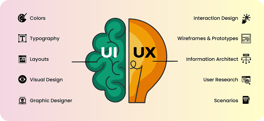
UI / UX Design
Why Good UI/UX Still Fails: The Psychology Traps Designers Overlook
Discover why good UI/UX fails and how hidden UI/UX psychology traps impact
user decisions. Learn how emotional triggers, trust signals, and brain-driven behavior
shape real digital experiences.
“Your UI looks great. But no one clicks. Why?”
It’s every designer’s nightmare.
Pixel-perfect screens. Clean layouts. Great color palette. Smooth animations.
And still, users don’t convert.
Here’s the truth most teams ignore:
Users don’t make decisions based on design. They make decisions based
on psychology.
Your interface might follow every trend – but if it goes against how the brain works,
users simply scroll past, freeze, or bounce. Not because the UI is bad, but because the
mind behind the screen didn’t feel safe, motivated, or confident enough to take the
next step.
Let’s break down the psychological traps silently killing conversions – and how to fix
them with Psychology in UI/UX.
Common Cognitive Biases Designers Overlook
Most users don’t consciously analyse your interface. They respond automatically, emotionally, and intuitively, influenced by the same brain shortcuts that guide everyday decisions.
Here are the psychological traps that quietly sabotage even the most beautiful UI.
3. Choice Overload – When “More Options” Kills Action
We like having options until there are too many of them.
When users face multiple CTAs, several entry points, or a cluttered screen, it triggers cognitive overload. The brain sees effort, and effort feels uncomfortable.
Examples:
- Six CTAs in the hero section
- A navigation bar packed with 8+ items
- Signup forms that ask for everything up front
Pricing tables with endless comparisons
What happens?
The user freezes.
Or bounces.
Not because they don’t like your product – but because their brain feels overwhelmed.
The fix?
Fewer choices = faster decisions.
2. Anchoring Bias – First Impressions Shape Everything
Anchoring is powerful: the first thing a user sees becomes the baseline for every decision afterward.
If the first experience feels heavy or unclear, the user assumes the rest of the journey will be the same.
Examples:
- A dense paragraph as the first element
- A high-priced plan is shown first
- A complicated signup flow was introduced immediately
The “anchor” defines perception.
The brain sticks to it.
And most users won’t give your product a second chance.
3. Loss Aversion – Fear of Losing > Desire to Gain
Humans hate losing more than they enjoy winning – and bad UX amplifies this fear.
Examples:
- Clicking a CTA that doesn’t explain what comes next
- Forms that wipe out data when an error appears
- Checkout pages without trust badges
- Unclear pricing or terms
The user thinks:
“I might lose time, money, privacy, or effort.”
That emotional discomfort becomes a blocker – even if your product is great.
4. The Curiosity Gap – When You Reveal Too Much or Too Little
Curiosity drives exploration.
But many designs kill curiosity by:
- Dumping all information at once
- Revealing almost nothing
- Using walls of text
- Offering no reason to scroll
The brain loves small mysteries.
A hint.
A teaser.
A preview of value.
You don’t need clickbait – you just need to give users a reason to continue.
How These Biases Impact Conversions
Cognitive biases in design don’t just influence behaviour – they quietly shape every micro-decision a user makes. When your UI accidentally triggers the wrong bias, even a visually polished design can break the entire conversion flow.
Let’s walk through a few real-world examples to see how these psychological traps show up in everyday interactions.
Signup Flow Example – When “Simple” Feels Like Work
Imagine a user lands on your signup page, ready to take action. Instead, they’re met with:
- Eight back-to-back form fields
- A generic, emotionless “Submit” button
- No progress bar to show how long the process will take
- No social proof or trust badges
- Flat, neutral visuals that feel cold and transactional
Here’s what happens inside the brain:
- Choice Overload: Eight fields immediately signal effort. The brain calculates the “cost” — and decides it’s too high.
- Loss Aversion: Without reassurance (e.g., “We’ll never spam you” or “Cancel anytime”), the brain fears loss of time, privacy, or control.
- Zero Curiosity: Nothing is pulling the user forward. No motivation triggers. No emotional pull.
Result: A huge chunk of users abandon the page before entering even the first detail.
Not because they don’t want your product, but because the experience felt like work.
Pricing Page Example – When Users Can’t Anchor, They Don’t Choose
Your pricing page is one of the most psychologically sensitive screens in your entire product. But many designs unintentionally confuse users by presenting:
- Plans that all look visually equal
- Long, dense feature lists that blur together
- No highlighted “Recommended” or “Best Value” plan
- No customer numbers, badges, or case studies
Psychological impact:
- Anchoring Confusion: Without a clear anchor plan, users don’t know where to start. The brain needs a “first reference point” to compare values.
- Cognitive Overload: Too much text forces users into System 2 thinking (slow, analytical), which they avoid unless necessary.
- Loss Aversion:
No trust signals = “Is this safe? Am I choosing wrong?”
The user prefers not deciding over making a risky decision.
Result: Users postpone, rethink, or bounce – even if your pricing is actually great.
Landing Page Example – When Curiosity Dies, So Does Conversion
The hero section is your brand’s first impression and the most emotional moment. But many landing pages unintentionally kill engagement by showing:
- A headline that doesn’t say anything meaningful
- Two heavy paragraphs users won’t read
- Multiple CTAs with no clear priority
- A weak visual hierarchy that confuses the eye
Psychological impact:
- Curiosity Gap Collapse: If nothing sparks interest in the first 2 seconds, the brain checks out.
- Choice Overload: “Learn more,” “Book demo,” “Try free,” “Explore features” – too many doors = no entry.
- Low Motivation: No emotional payoff. No reason to scroll. Nothing that signals value.
Result: The user leaves – not because the design is bad, but because it didn’t make them feel anything.
Fixing Design with Psychology-First UX
Design improves dramatically when we design for the mind, not just the screen. Here’s how to turn psychological friction into flow.
- Simplification – The Brain Loves Breathing Space
“Simple” isn’t plain. Simple is clear, intentional, and mentally light.
To simplify:
- Reduce form fields to essentials
- Give one clear CTA per screen
- Remove decorative distractions
- Break content into digestible chunks
A simple interface feels safe, and a safe interface converts.
- Predictable Navigation – Comfort Creates Confidence
Humans trust what feels familiar. Predictable UX decision-making patterns do two things:
- Reduce cognitive strain
- Increase perceived reliability
Ways to improve predictability:
- Keep navigation labels familiar (Home, Pricing, Contact)
- Avoid reinventing common patterns unless necessary
- Maintain consistent placement of buttons and menus
When navigation feels intuitive, the user focuses on the content – not on figuring out the UI.
- Neuro-Friendly CTA Placement – Put the Action Where the Brain Expects It
A CTA is a psychological moment, not just a button.
To make it irresistible:
- Place it where the eye naturally lands (right side / below key info)
- Use action-first microcopy (“Start Free,” “See Plans,” “Continue”)
- Surround it with trust signals
- Make it visually distinct but not aggressive
A CTA should feel like the natural next step – not a forced decision.
Conclusion: Great Design Isn’t Enough – Psychology Makes It Work
A screen can look beautiful, modern, and well-structured, and still fail if it ignores Psychology-driven design.
Because users don’t interact with your design logically, they interact with it emotionally, instinctively, and unconsciously.
At Karm Digital, we create experiences built for the mind: clear, intuitive, emotionally intelligent, and grounded in real human behaviour.
related blog
-
WordPress vs Webflow: Which Platform is Better for Your Website in 2026?
-
Figma vs Webflow: Website Design vs Development Explained
-
Impact of eBooks in Digital Marketing: Lead Generation & Brand Authority
-
Neuromarketing in UI/UX: How the Brain Decides Before the User Thinks
-
Designing for Trust: Psychological Triggers That Make Users Say ‘Yes’
-
AEO vs SEO: Why Answer Engine Optimization Is Rising in 2026?
-
Emerging UI/UX Trends for 2026: A Complete Breakdown
-
How to Measure Your SEO Success: The Real Metric Most Businesses Ignore
-
Why Good UI/UX Still Fails: The Psychology Traps Designers Overlook

Begin Your Karma

Karmic Presence

INDIA
- elephant@karm.digital
- Vraj Valencia, Behind Mahindra Showroom, Sarkhej Bridge, Sarkhej - Gandhinagar Hwy, Sola, Ahmedabad, Gujarat 380060