
Ingress Bio Logo Design and Branding: Agriculture Brand Identity for a Biofertilizer Company
How Karm Digital delivered logo design and branding to transform Ingress Bio into a clear, science-led agriculture brand
CLIENT
Ingress Bio
INDUSTRY
Agriculture, Biofertilizers & Soil Science
HEADQUARTERS
India
Engagement
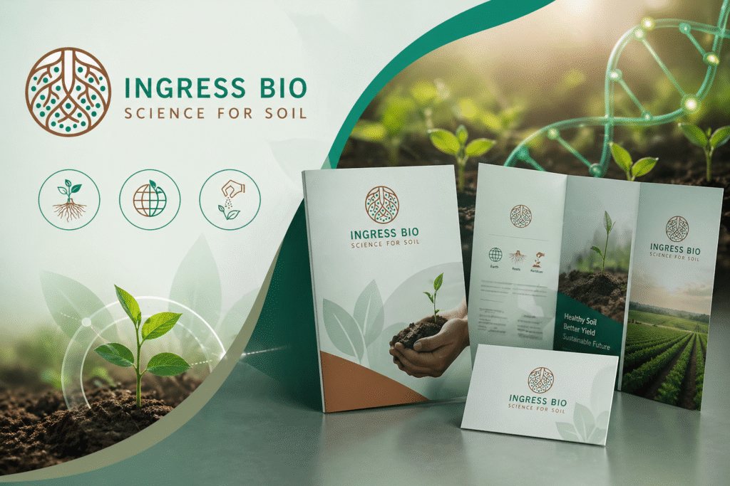
Logo Design and Branding, Brand Identity Design, Brochure Design & Stall Design
OVERVIEW
Transforming Soil Science into a Brand People Understand
Ingress Bio operates in a space where science meets the soil.
As a manufacturer of lab-grown mycorrhiza biofertilizers, their work is deeply rooted in research, sustainability, and long-term soil health. But while their products are driven by scientific precision, their audience extends far beyond laboratories.
Farmers, distributors, and agricultural stakeholders don’t engage with complexity,
They engage with clarity.
This is where the gap existed.
A gap between what Ingress Bio does
and how easily it could be understood
Karm Digital partnered with Ingress Bio to bridge this gap through logo design and branding, building a brand identity that simplifies science into something visual, meaningful, and accessible.
This wasn’t just about design.
It was about creating a system where
Science becomes understandable, and branding drives trust.
THE CHALLENGE
Making Scientific Innovation Easy to Understand
Ingress Bio’s solutions are built on advanced biological processes. However, their communication needed to resonate with audiences who may not be familiar with scientific terminology.
The challenge was to translate:
- Soil biology
- Mycorrhiza technology
- Sustainable agriculture practices
into communication that feels simple, visual, and intuitive.
Balancing Nature and Science in Agriculture Branding
Agriculture branding often leans either toward natural imagery or scientific credibility.
Ingress Bio needed both.
The brand had to feel:
- Natural enough for farmers to relate
- Scientific enough to build trust
Striking this balance was essential to building a strong biofertilizer brand identity.
Creating a Unified and Scalable Brand System
There was no consistent identity across:
- Logo applications
- Brochures
- Stall design
The need was to create a cohesive brand identity design system that could scale across all touchpoints while maintaining clarity and recall.
THE OPPORTUNITY
The shift toward sustainable agriculture and soil health awareness is growing rapidly.
Farmers and agri-businesses are increasingly looking for:
- Reliable biofertilizers
- Science-backed solutions
- Easy-to-understand products
Ingress Bio already had the science.
What they needed was:
A brand that communicates science simply and effectively.
This created an opportunity to build:
- A meaningful logo design rooted in purpose
- A clear agriculture branding system
- A scalable communication framework
Karm Digital’s Branding Strategy
Designing a Brand Where Meaning Drives Identity
Karm Digital approached this as more than a branding project.
It began with a deeper question:
What does Ingress Bio truly stand for?
The answer was found not in words,
but in the soil itself.
1. The Story Behind the Logo: Where Purpose Shapes Design
A powerful logo doesn’t start with design.
It starts with meaning.
For Ingress Bio, that meaning lived deep within the earth they nurture.
The logo was built around three purposeful elements:
- The Circle – representing the Earth, they aim to protect
- The Roots – symbolizing the inner life of soil and biological activity
- Organic Fertilizer Form – expressing their natural, science-led approach to nourishment
Individually, these elements represent nature.
Together, they tell a larger story,
a system of balance, growth, and sustainability.
The logo becomes more than a symbol.
It becomes a visual narrative of Ingress Bio’s mission:
To restore balance to the soil through science.
From initial sketches to the final identity, every detail was designed to reinforce one core idea:
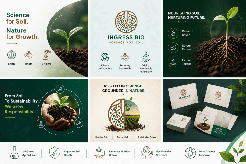
Science for Soil. Nature for Growth.
2. Brand Identity Design: Building a Nature-Science Balance
The brand identity design extended this philosophy across all visual elements.
The color palette was carefully chosen to reflect:
- Earth tones for grounding and trust
- Green tones for growth and sustainability
Typography remained clean and modern to maintain scientific credibility, while design elements stayed organic to ensure approachability.
Supporting icons like:
- Earth
- Roots
- Fertilizer
helped simplify complex ideas into instantly understandable visuals.
The result was a brand identity that feels:
Balanced, intuitive, and meaningful.
3. Brochure Design: Structuring Communication for Clarity
In agriculture marketing, brochures play a critical role in decision-making.
We redesigned the brochure to ensure:
- Clear information hierarchy
- Easy navigation of content
- Visual storytelling over dense text
Instead of overwhelming the reader, the brochure guides them through:
What the product is
How it works
Why it matters
This approach improves both understanding and engagement.
4. Stall Design: Bringing the Brand to Life
The stall design translated the brand into a physical experience.
The goal was to create a space that:
- Feels natural and inviting
- Communicates clearly at a glance
- Encourages interaction
Through clean layouts, strong visuals, and consistent branding, the stall became a space where visitors could quickly understand Ingress Bio’s value.
Execution: Consistency Across Every Touchpoint
Execution focused on ensuring that the brand remains consistent everywhere it appears.
Every element followed a unified system:
- Colors
- Typography
- Visual patterns
This created a seamless experience across:
- Print materials
- Exhibitions
- Brand communication
Consistency ensured that the brand builds recognition and trust over time.
Impact: From Complexity to Clarity
The transformation reshaped how Ingress Bio is perceived.
The brand evolved from:
A technically strong but complex organization
to
A clear, structured, and approachable agriculture brand
The logo design and branding project resulted in:
- Improved brand clarity
- Stronger visual identity
- Better engagement with agricultural audiences
- Increased trust among stakeholders
Most importantly,
It made science easier to understand and adopt.
Why This Case Study Matters
In agriculture and biofertilizer industries,
Communication is often the biggest barrier to growth.
This case study shows that:
Branding is not just about how things look,
It’s about how easily they are understood.
Karm Digital helped Ingress Bio turn purpose into identity
and identity into impact.
The Road Ahead
With a strong brand foundation in place,
Ingress Bio is now positioned to scale its communication and market presence.
The next phase includes:
- Expanding awareness among farmers
- Strengthening agri marketing efforts
- Building long-term brand recall
Because once understanding is established,
adoption follows.
Conclusion
Ingress Bio × Karm Digital
This partnership reflects what happens when intention becomes identity.
Together, we transformed a science-led company
into a brand that communicates naturally and clearly.
Because in agriculture,
the brands that grow
These are the ones that are understood.
This is Ingress Bio ka, Karm –
Where intention becomes identity,
and a logo becomes a living symbol of purpose.
FAQS
Logo design and branding help agriculture and biofertilizer companies simplify complex scientific solutions into clear, visual communication. A strong brand identity builds trust among farmers, distributors, and stakeholders, making it easier to adopt new products.
A strong agriculture brand identity design balances natural elements with scientific credibility. It uses earthy colors, clean typography, and meaningful visuals to communicate both sustainability and innovation effectively.
Branding plays a key role in agri marketing by making products easier to understand and remember. Clear visual identity and structured communication help farmers quickly grasp product benefits and build long-term trust.
The Ingress Bio logo design is based on three key elements: Earth, Roots, and Fertilizer, representing soil health, biological activity, and sustainable nourishment. Together, these elements create a meaningful brand symbol rooted in science and nature.
Brochure design helps break down technical information into structured, easy-to-read content. It improves clarity, supports visual learning, and helps users understand product benefits quickly, which is essential in agricultural marketing.
Strategy Measured by Results
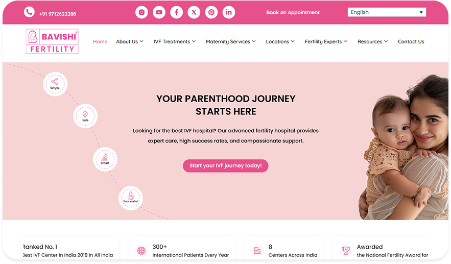
Breaking the Taboos Around IVF Through Digital Storytelling CLIENT Bavishi Fertility Institute …
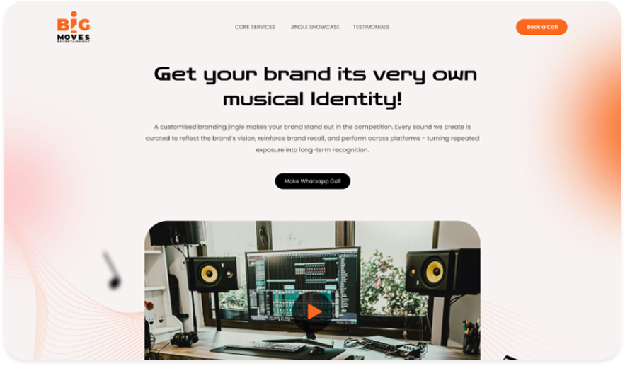
Designing a Lead-Driven Landing Page for Jingle-Led Brand Recall How Karm is …
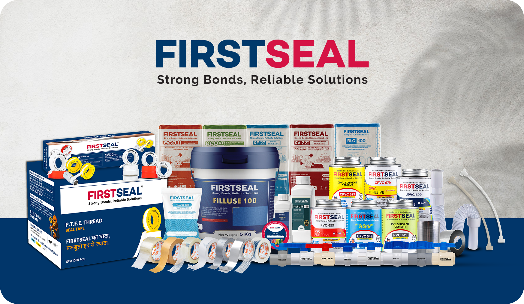
Designing Industrial Packaging That Builds Trust at First Sight How Karm turned …

Karm-Aligned Brands


Milan Patel
Joint MD, Troikaa Pharma & NutraceuticalsKrupa is Committed and has a very time bound work attitude. Also she's very efficient in understanding the customers needs which good subject area knowledge, strategy designing and planning.

Begin Your Karma
Karmic Presence
INDIA
- elephant@karm.digital
- Vraj Valencia, Behind Mahindra Showroom, Sarkhej Bridge, Sarkhej - Gandhinagar Hwy, Sola, Ahmedabad, Gujarat 380060